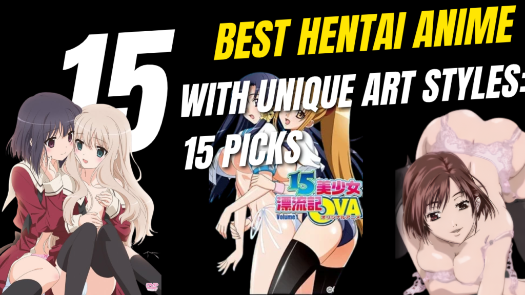
Best Hentai Anime With Unique Art Styles: 15 Titles Worth Exploring
When people talk about hentai anime, the conversation often revolves around popular titles, storylines, or memorable characters. However, one aspect that deserves just as much attention is the artwork itself. Different anime can have completely different visual identities, from the hand-drawn aesthetics of the 1980s and 1990s to the polished digital coloring and detailed character designs of the 2000s.
Some adult anime stand out because of their atmospheric backgrounds, while others are remembered for their fantasy-inspired worlds, distinctive character designs, or cinematic animation. These visual differences also reflect how Japanese animation techniques and artistic preferences evolved over time.
If you’re interested in discovering adult anime with distinctive visual styles, this list explores 15 titles worth examining. Rather than focusing only on popularity, we’ll look at the artistic qualities that make each title visually recognizable.
Note: This guide discusses adult animation and its artistic characteristics. Some titles contain explicit sexual content, graphic violence, or disturbing themes. Check the content classification before viewing.
Visit Night anime for the best and premium hentai to watch without ads or pay.
1. Stainless Night (1995)
Art style: Retro 1990s animation
Stainless Night represents the visual characteristics associated with adult OVAs from the 1990s. Its period-specific character designs and traditional animation aesthetics make it an interesting example for viewers exploring the history of adult anime.
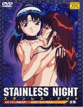
One of the defining characteristics of anime from this era is its hand-drawn appearance. Linework, facial proportions, shading, and painted backgrounds can create a visual atmosphere that differs considerably from contemporary digital animation.
For viewers who appreciate vintage anime artwork, Stainless Night offers an opportunity to explore the aesthetics of its period.
What makes its art style distinctive?
- Character designs associated with 1990s anime.
- Traditional animation aesthetics.
- A visual presentation that reflects its release era.
2. Front Innocent (2004)
Art style: Detailed illustrations and period-inspired settings
Front Innocent is notable for its elaborate character illustrations and period-inspired visual presentation. Its aesthetic draws attention to costume details, carefully composed scenes, and the appearance of its historical setting.
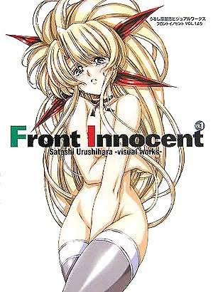
Compared with the simpler presentation found in some older productions, its detailed illustrations give the artwork a more elaborate appearance. Costume design and background elements help establish the atmosphere, making the visual presentation an important part of the viewing experience.
The title is particularly relevant to a discussion of adult anime artwork because it illustrates how detailed illustrations can shape the identity of an individual production.
What makes its art style distinctive?
- Detailed character illustrations.
- Elaborate costume and setting design.
- A period-inspired visual atmosphere.
3. Bible Black (2001)
Art style: Dark atmosphere and gothic-inspired visuals
Bible Black is recognizable for its dark atmosphere and supernatural themes. Its visual identity relies on dramatic lighting, shadow, and imagery designed to create an unsettling mood.
Rather than presenting a bright, cheerful world, the series uses darker visual elements to reinforce its supernatural subject matter. The contrast between light and shadow contributes to the atmosphere, while its character designs reflect the early-2000s adult anime aesthetic.
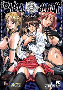
For viewers interested in how artwork contributes to mood, Bible Black provides an example of the relationship between visual presentation and dark storytelling.
What makes its art style distinctive?
- Dark, atmospheric compositions.
- Dramatic use of shadows and contrast.
- Supernatural and gothic-inspired visual elements.
4. Words Worth (1999)
Art style: Fantasy-inspired character designs
Fantasy settings provide artists with opportunities to experiment with costumes, architecture, landscapes, and character designs. Words Worth uses a fantasy-oriented visual approach that distinguishes it from more contemporary or realistic settings.
Its elaborate costumes and fantasy imagery contribute to the series’ visual identity. The setting also creates opportunities for more imaginative designs than those typically found in everyday environments.
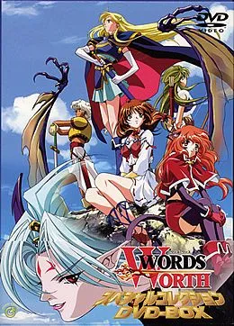
For anyone studying the variety of styles found in adult anime, Words Worth is an interesting title to consider because of its emphasis on fantasy aesthetics.
What makes its art style distinctive?
- Fantasy-inspired character designs.
- Elaborate costumes.
- An imaginative setting and visual world.
5. La Blue Girl (1992)
Art style: Traditional 1990s OVA aesthetics
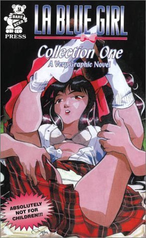
La Blue Girl combines supernatural fantasy with the visual characteristics associated with older Japanese OVAs. Its artwork reflects an era when hand-drawn animation was central to the production process.
The series’ supernatural themes provide a foundation for its imaginative imagery and character designs. Its visual presentation also offers a useful comparison with contemporary anime, particularly in terms of linework, color, and the appearance of traditional animation.
For fans of vintage anime, La Blue Girl is worth examining as an example of the artistic conventions of early-1990s adult animation.
What makes its art style distinctive?
- Traditional OVA-era visual characteristics.
- Supernatural and fantasy imagery.
- Character designs associated with early-1990s anime.
6. Urotsukidōji: Legend of the Overfiend (1987)
Art style: Dark fantasy and dramatic creature designs
If you’re looking for a title with a distinctive old-school dark fantasy aesthetic, Urotsukidōji: Legend of the Overfiend deserves consideration.
The series is known for its supernatural subject matter, striking creature designs, and disturbing imagery. Its late-1980s animation style gives it a visual identity that differs significantly from modern anime productions.
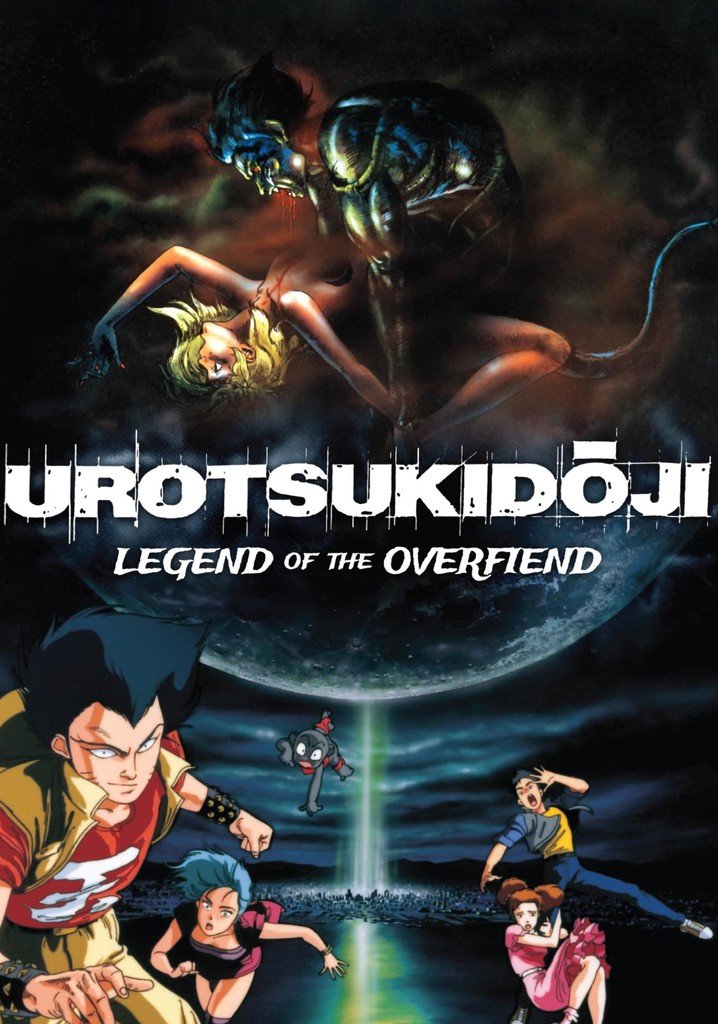
Creature design is particularly important when discussing this title. The exaggerated forms and otherworldly imagery contribute to its unsettling atmosphere, demonstrating how character and creature designs can shape the identity of a fantasy production.
This title is also associated with graphic violence and disturbing material, so viewers should check its content before watching.
What makes its art style distinctive?
- Dark fantasy imagery.
- Dramatic supernatural creature designs.
- A recognizable late-1980s animation aesthetic.
7. Mezzo Forte (2000)
Art style: Dynamic animation and cinematic compositions
Unlike titles whose visual identities depend primarily on fantasy imagery or atmospheric backgrounds, Mezzo Forte is notable for its action-oriented presentation.
Its sharp character designs and dynamic compositions contribute to a more cinematic visual experience. Movement, framing, and the arrangement of characters within a scene are important elements of its presentation.
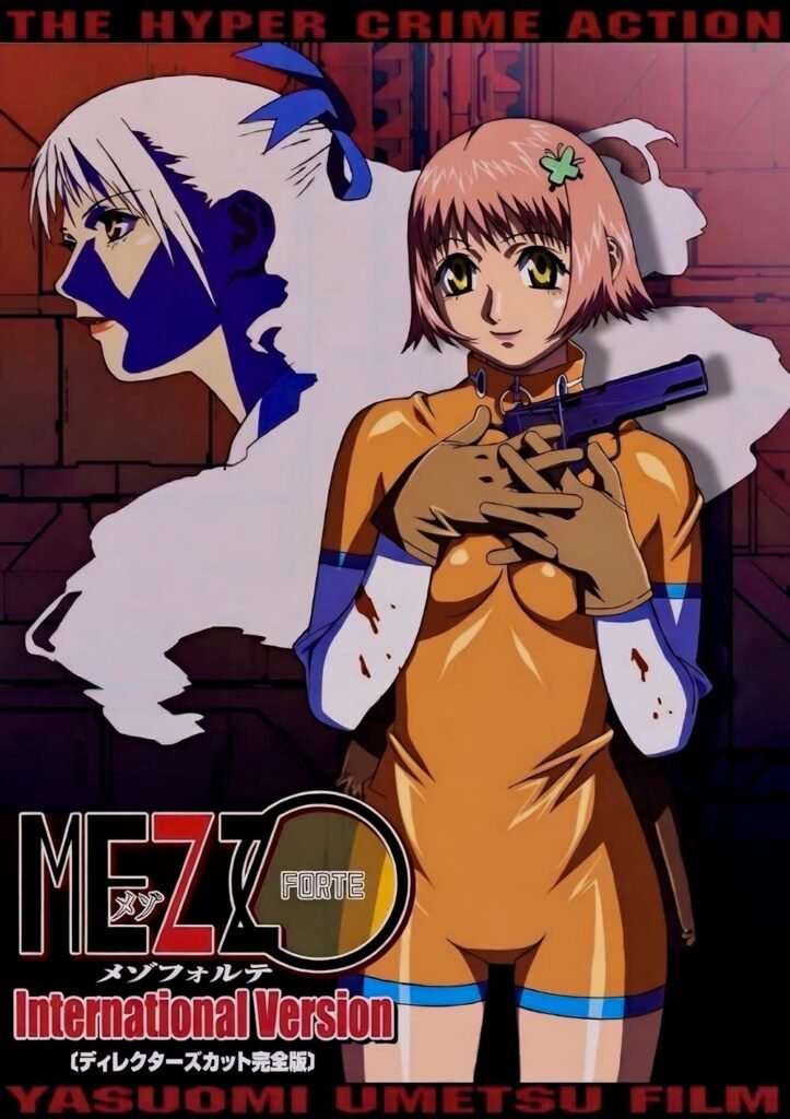
The title is particularly interesting because it demonstrates how animation can create visual impact through movement rather than relying exclusively on elaborate illustrations.
For viewers who appreciate action anime and carefully composed scenes, Mezzo Forte is one of the strongest candidates on this list.
What makes its art style distinctive?
- Sharp character designs.
- Dynamic action animation.
- Cinematic framing and compositions.
8. A Kite (1998)
Art style: Gritty atmosphere and cinematic framing
A Kite is frequently discussed for its distinctive animation and dark, cinematic presentation. Its visual identity combines stylized character designs with an atmosphere that feels markedly different from lighter or more colorful anime.
Framing and composition play an important role in establishing the mood. Rather than making every scene visually elaborate, the production uses its presentation to support a darker tone.
The animation also demonstrates how character movement and scene composition can contribute to the overall identity of a production.
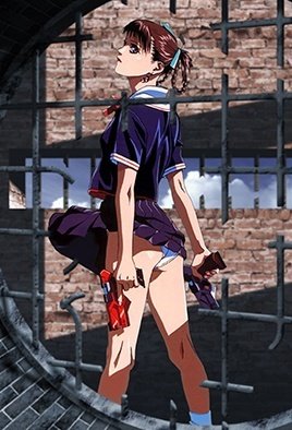
For this article, A Kite is particularly relevant because it illustrates how visual style encompasses more than character illustrations alone.
What makes its art style distinctive?
- Stylized character animation.
- Gritty visual atmosphere.
- Cinematic framing and composition.
9. Cream Lemon (1984)
Art style: Early adult anime aesthetics
Cream Lemon holds a place in the history of Japanese adult animation. Beginning in the 1980s, the OVA series is useful for understanding the variety of artistic approaches found in early adult anime.
An important distinction is that Cream Lemon is an anthology-style series rather than a single production with one uniform visual identity. Its different installments can vary in character designs, presentation, and artistic approach.
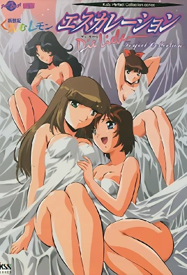
That variation makes it particularly interesting from an artistic perspective. It provides an opportunity to examine how different visual approaches existed within the same broader franchise.
For viewers researching the history of adult anime, Cream Lemon is a worthwhile historical reference.
What makes its art style distinctive?
- Visual characteristics associated with 1980s animation.
- Variation in artistic presentation across installments.
- Historical relevance to adult OVA production.
10. Discipline: The Hentai Academy (2003)
Art style: Early-2000s character designs and digital-era coloring
Discipline: The Hentai Academy represents the visual conventions of adult anime from the early 2000s.
Compared with older productions, anime from this period increasingly reflected changes in coloring and digital production workflows. Character designs, shading, and color treatment contributed to a different overall appearance from that of many traditional cel-era productions.
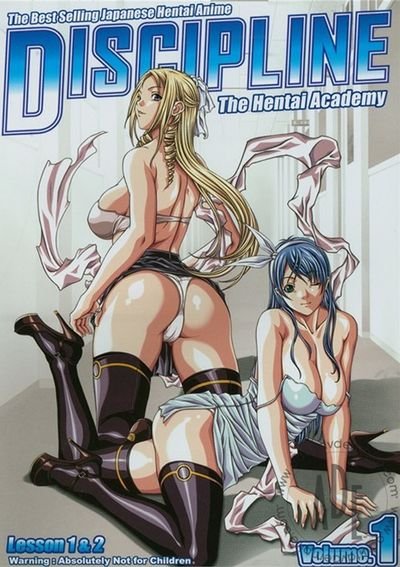
The title can therefore be included in a broader discussion of how adult anime artwork changed around the turn of the millennium.
Its visual presentation is most useful as a period example rather than as a claim that its animation is technically superior to older productions.
What makes its art style distinctive?
- Early-2000s character designs.
- Digital-era coloring aesthetics.
- A visual style representative of its production period.
11. Night Shift Nurses (2000)
Art style: Dramatic shadows and a dark visual atmosphere
Night Shift Nurses is another example of adult anime from around the beginning of the 2000s.
Its dark subject matter and dramatic presentation make lighting and contrast relevant elements to consider when discussing its visual identity. Shadow, color, and character design can influence the atmosphere of a scene, especially in productions that explore unsettling themes.
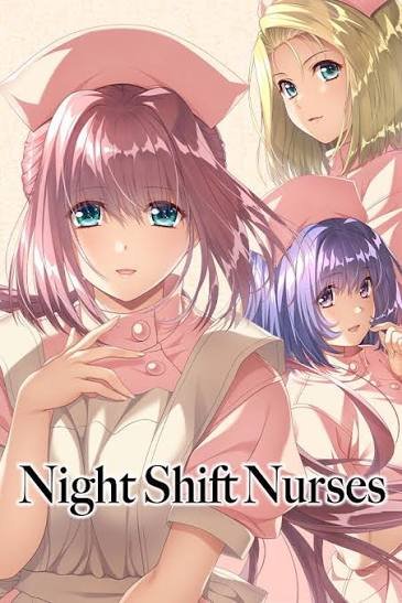
The series is better suited to readers interested in the darker side of adult anime than those looking for lighthearted or romantic visual styles.
Because it contains disturbing material, prospective viewers should review its content classification before watching.
What makes its art style distinctive?
- Dark visual presentation.
- Dramatic lighting and contrast.
- Character designs associated with early-2000s adult anime.
12. Sora no Iro, Mizu no Iro (2006)
Art style: Soft colors and detailed backgrounds
Sora no Iro, Mizu no Iro offers a different visual direction from the darker fantasy and supernatural titles on this list.
Its softer color palette and attention to backgrounds provide a useful contrast with productions that rely on dramatic shadows or exaggerated creature designs. The overall presentation places greater emphasis on a gentler visual atmosphere.
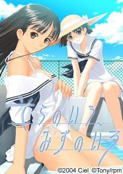
Color is one of the most important factors when comparing anime art styles. Even when two productions use broadly similar character designs, differences in color saturation, shading, and background treatment can make them feel entirely different.
This title helps illustrate that point.
What makes its art style distinctive?
- A comparatively soft color palette.
- Detailed background presentation.
- A visual atmosphere that contrasts with darker titles.
13. Stringendo + Accelerando: Ultimatum Sera (2008)
Art style: Glossy character illustrations and detailed coloring
Stringendo + Accelerando: Ultimatum Sera is associated with the digital-era visual conventions of adult anime from the late 2000s.
Its character illustrations and coloring provide a useful point of comparison with the hand-drawn aesthetics of earlier decades. Digital coloring can produce a different finish through gradients, smoother color transitions, and more controlled shading.
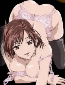
However, digital production does not automatically make an anime more visually appealing. The quality of the artwork also depends on composition, character design, consistency, and the choices made by the artists.
For readers interested in the development of adult anime’s visual presentation, this title offers another example from the period.
What makes its art style distinctive?
- Glossy character illustrations.
- Detailed digital-era coloring.
- A visual presentation associated with late-2000s adult animation.
14. 15 Bishoujo Hyouryuuki (2011)
Art style: Colorful digital-era character designs
15 Bishoujo Hyouryuuki provides another example of adult anime from the early 2010s.
By this period, digital coloring and computer-assisted production had become familiar parts of the broader anime industry. These techniques helped shape the appearance of character illustrations, shading, and color palettes across many productions.
The title can be considered within this context, particularly when comparing its era with the traditional animation aesthetics of the 1980s and 1990s.
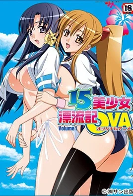
Its value in this list lies in providing a more recent reference point for readers interested in the evolution of adult anime artwork.
What makes its art style distinctive?
- Colorful character illustrations.
- Digital-era visual conventions.
- A production period distinct from classic 1980s and 1990s OVAs.
15. Sono Hanabira ni Kuchizuke wo: Anata to Koibito Tsunagi (2010)
Art style: Soft character designs and romantic aesthetics
Sono Hanabira ni Kuchizuke wo: Anata to Koibito Tsunagi offers a contrasting visual direction through its softer character designs and romantic presentation.
Rather than relying on dark fantasy imagery, exaggerated creatures, or gritty cinematic framing, its aesthetic is associated with a gentler, character-focused approach.
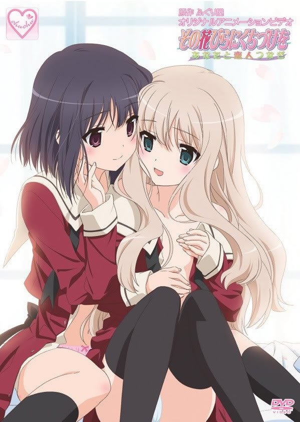
Soft colors and expressive character illustrations can help establish a romantic atmosphere. This makes the title useful for comparing the different visual approaches found within adult anime.
For readers interested in character design and romantic aesthetics, it provides a different perspective from the darker productions discussed earlier.
What makes its art style distinctive?
- Soft character designs.
- A romantic visual atmosphere.
- A presentation that contrasts with darker fantasy titles.
My Top 5 Picks: Hentai Anime With the Most Distinctive Art Styles
Although all 15 titles offer different points of comparison, five stand out as particularly useful choices for discussing distinctive visual identities.
These selections are based on their recognizable artistic approaches and their relevance to the history and variety of adult anime.
1. Urotsukidōji: Legend of the Overfiend
Best for: Old-school dark fantasy
Urotsukidōji is a strong choice for readers interested in the dramatic imagery associated with late-1980s fantasy animation. Its supernatural creatures and disturbing visual elements give it a recognizable identity.
It is particularly relevant when discussing how creature design and exaggerated imagery can establish the tone of a fantasy production.
2. A Kite
Best for: Gritty atmosphere and cinematic framing
A Kite deserves a place among the top five because its visual identity extends beyond character design. Its darker atmosphere, framing, and stylized animation contribute to a cinematic presentation.
It is an especially useful example when explaining why composition and mood matter just as much as illustration quality.
3. Mezzo Forte
Best for: Dynamic animation and action-oriented compositions
Mezzo Forte stands out for its action-focused visual presentation. Its character designs, movement, and cinematic compositions provide a different experience from the more atmospheric or fantasy-oriented titles on this list.
For readers who value animation and visual storytelling, it is an important title to consider.
4. Front Innocent
Best for: Detailed illustrations and period-inspired settings
Front Innocent is worth highlighting for its elaborate illustrations and historical visual influences.
Costumes, backgrounds, and character details help establish its distinctive presentation, making it a useful example of how setting and illustration can contribute to an anime’s artistic identity.
5. Cream Lemon
Best for: Historical significance and stylistic variety
Cream Lemon earns a place in this selection because of its historical relevance to adult anime and the variation in visual approaches across its installments.
For readers interested in the development of adult animation, it provides a useful starting point for exploring the medium’s earlier visual conventions.
How to Choose Hentai Anime Based on Art Style
If you’re exploring adult anime primarily for its artwork, it helps to look beyond a title’s popularity. Several elements can make a production visually distinctive.
1. Character Design
Look at the way characters are drawn, including facial proportions, hairstyles, clothing, and silhouettes. Distinctive character design can make an anime recognizable even in a single frame.
2. Animation Techniques
Older productions may feature traditional cel-animation aesthetics, while newer titles may use digital coloring and other computer-assisted techniques.
Neither approach is automatically better. Each has its own visual characteristics.
3. Color Palette
Some productions rely on muted colors and deep shadows, while others use bright colors or softer tones. Color choices can establish mood and help distinguish one title from another.
4. Background Art
Backgrounds contribute significantly to an anime’s atmosphere. Elaborate fantasy settings, historical environments, and simple everyday locations can all create different visual experiences.
5. Composition and Lighting
The arrangement of characters and objects within a scene affects how the viewer experiences it. Dramatic lighting, unusual framing, and carefully arranged compositions can make a production stand out.
Final Thoughts
Adult anime has developed through several decades of changing animation techniques, artistic preferences, and production methods. From the traditional aesthetics of 1980s and 1990s OVAs to the digital coloring associated with the 2000s, each period offers different visual characteristics worth exploring.
Titles such as Urotsukidōji, A Kite, and Mezzo Forte demonstrate how atmosphere, composition, and animation can contribute to a distinctive visual identity. Meanwhile, Front Innocent and Cream Lemon offer different perspectives on illustration and the historical development of adult anime.
Ultimately, the most interesting art style is a matter of personal preference. Some viewers prefer dark fantasy imagery, while others appreciate detailed illustrations, dynamic movement, or softer color palettes.
If you’re exploring adult anime for its artistic qualities, comparing these elements can help you discover which visual styles appeal to you most.
Editorial note: This list focuses on adult animation and visual style. Before publishing, verify each title’s release information, classification, and content warnings. Keep recommendations limited to works featuring adult characters, and avoid presenting explicit content or disturbing themes as suitable for all audiences.